body {
background: linear-gradient(90deg, #ee7752, #e73c7e, #23a6d5, #23d5ab);
background-size: 400% 400%;
animation: gradient 10s ease infinite;
transform: translate3d(0, 0, 0);
}
@keyframes gradient {
0% {
background-position: 0% 50%;
}
50% {
background-position: 100% 50%;
}
100% {
background-position: 0% 50%;
}
}
OUR COMPANY
Bring Your Ideas to Life
Everything that you dreamed of can be brought to life exactly at the moment when you decide to win.


Как сделать
1. Создаем шейп, при наведении на который будет появляться картинка
2. Добавляем изображение и ставим
POINTER EVENTS «None»
3. Анимируем изображение по ховеру:
1 шаг - duration 0, opacity 0
2 шаг - duration 0,2, opacity 100
3 шаг - duration 0,1, opacity 100
4. Повторяем для всех изображений.
2. Добавляем изображение и ставим
POINTER EVENTS «None»
3. Анимируем изображение по ховеру:
1 шаг - duration 0, opacity 0
2 шаг - duration 0,2, opacity 100
3 шаг - duration 0,1, opacity 100
4. Повторяем для всех изображений.

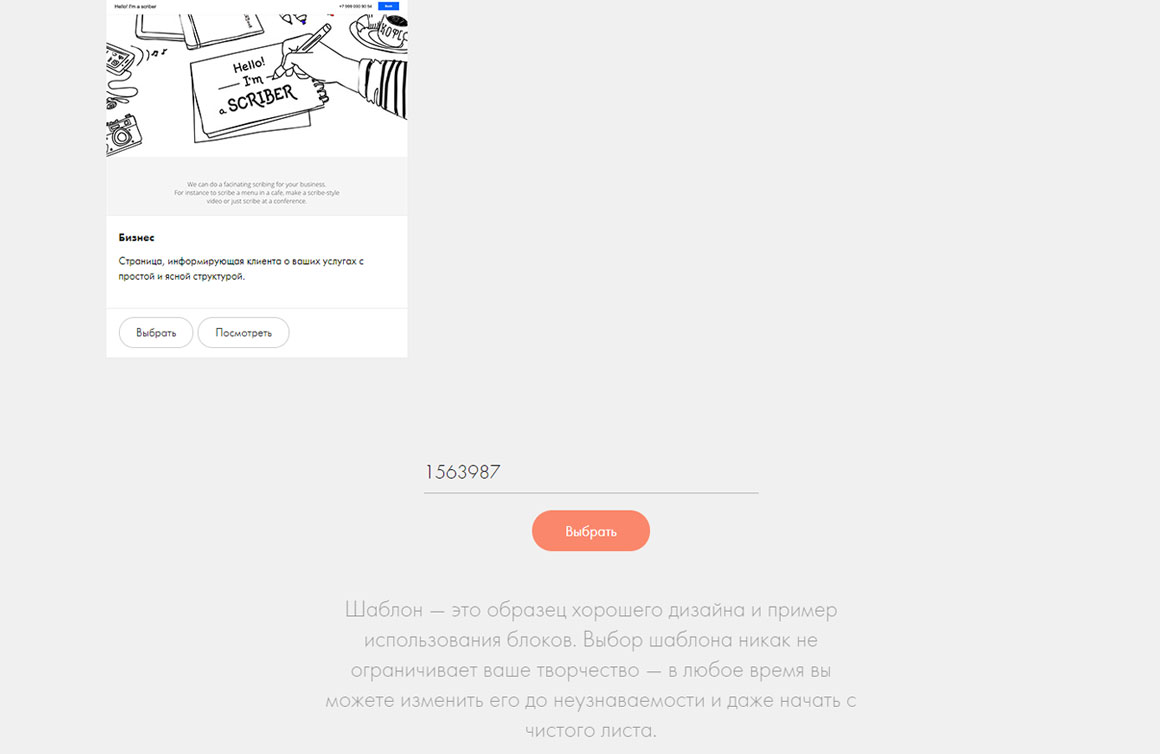
ID шаблона
17913147
Как добавить шаблон
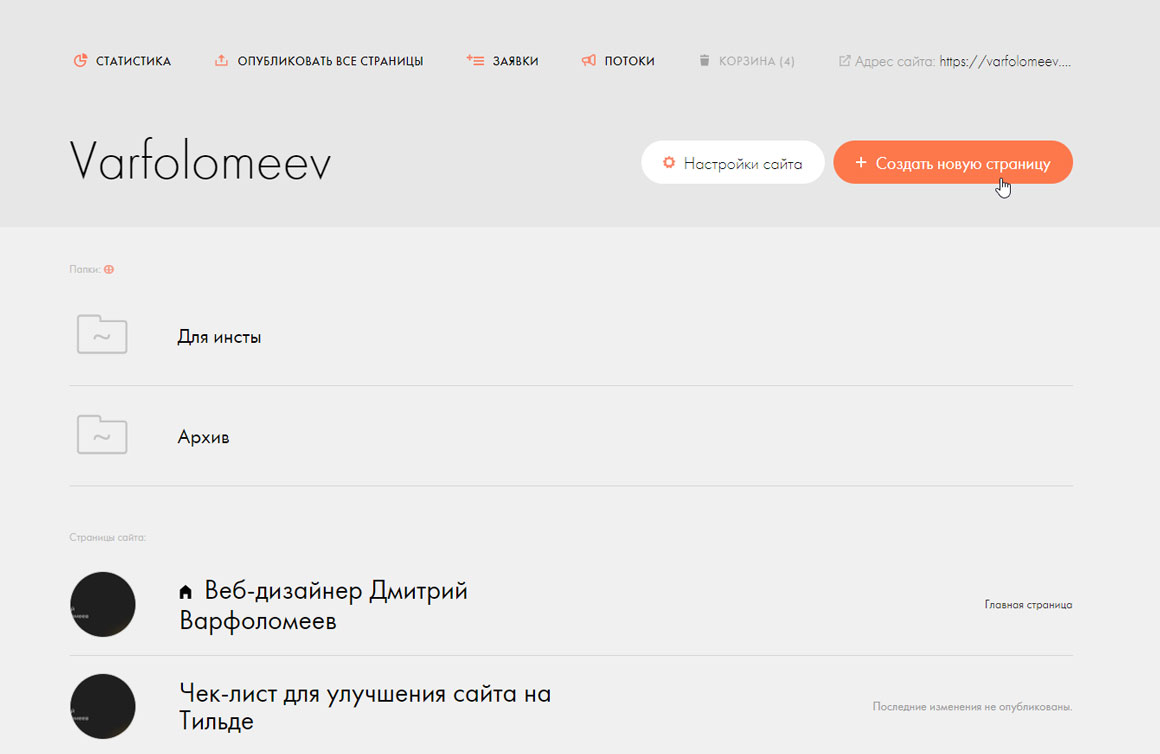
Создаем новую страницу на сайте
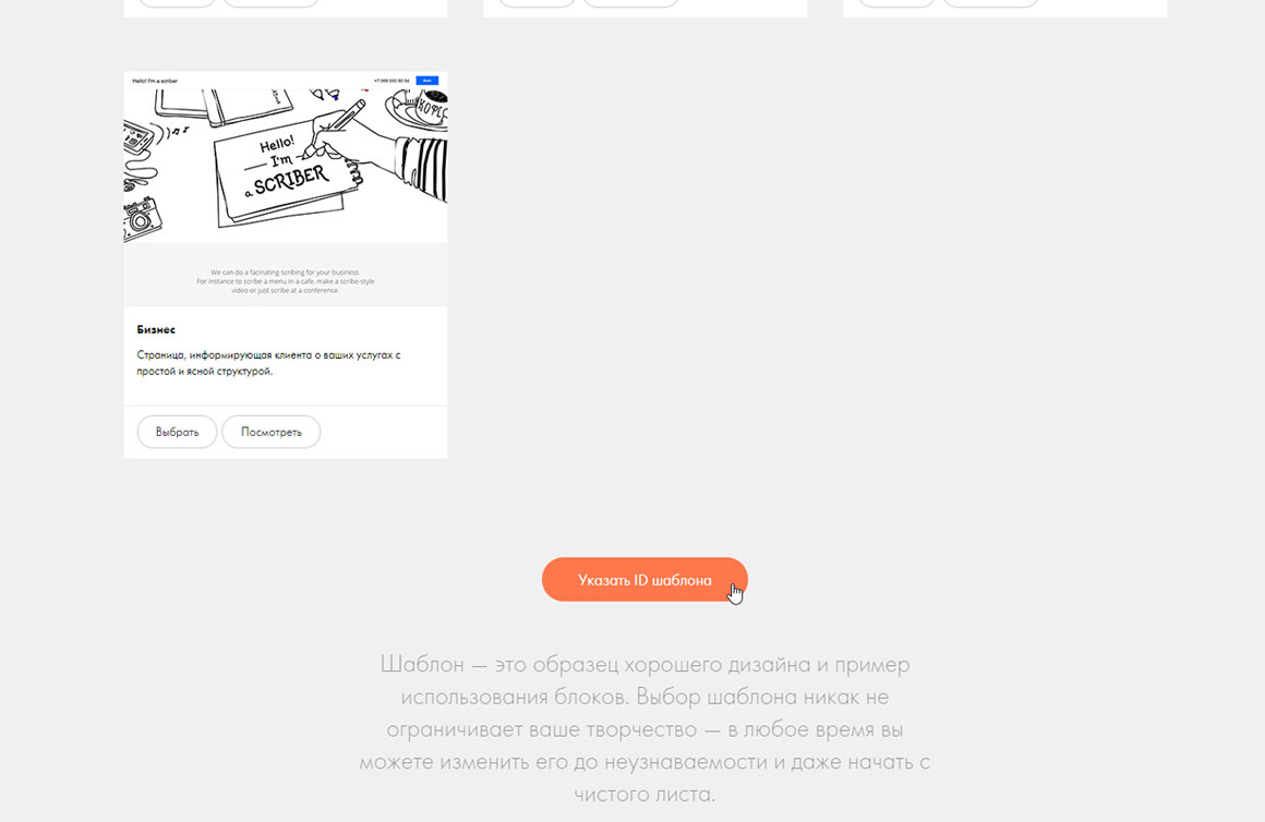
Скроллим в самый низ
Добавляем нужный id шаблона